
Designing care navigation that helped 43%
of members find lower prescription drug prices
Designing care navigation that helped
43% of members find lower prescription
drug prices
Designing care navigation that helped
43% of members find lower
prescription drug prices
Designing care navigation
that helped 43%
of members find lower
prescription drug prices
OVERVIEW
I.
Bringing five care verticals
into one member experience
Bringing five care verticals
into one member experience
Bringing five care verticals
into one member experience
Transcarent — a $3B healthcare platform —
offers care through a single consumer app
spanning medical, dental, vision, pharmacy,
and behavioral health, built on at-risk pricing,
where the business is incentivized by outcomes
and cost savings rather than volume.
We designed the consumer mobile experience —
unifying five care verticals into one navigation
built around member needs rather
than healthcare-system structure.
Transcarent — a $3B healthcare platform —
offers care through a single consumer app
spanning medical, dental, vision, pharmacy,
and behavioral health, built on at-risk pricing,
where the business is incentivized by outcomes
and cost savings rather than volume.
We designed the consumer mobile experience —
unifying five care verticals into one navigation
built around member needs rather than
healthcare-system structure.
Transcarent — a $3B healthcare platform —
offers care through a single consumer app
spanning medical, dental, vision, pharmacy,
and behavioral health, built on at-risk
pricing, where the business is incentivized
by outcomes and cost savings rather
than volume. We designed the consumer
mobile experience — unifying five care
verticals into one navigation built around
member needs rather than healthcare-
system structure.
Transcarent — a $3B healthcare platform —
offers care through a single consumer app spanning
medical, dental, vision, pharmacy, and behavioral
health, built on at-risk pricing, where the business
is incentivized by outcomes and cost savings rather
than volume. We designed the consumer mobile
experience — unifying five care verticals into one
navigation built around member needs rather
than healthcare-system structure.
4.8
43%
App Store rating across 1600+ reviews
App Store rating across
1600+ reviews
App Store rating across
1600+ reviews
App Store rating across 1600+ reviews
Members found lower prescription drug prices
via the in-app prescription-matching flow
Members found lower prescription
drug prices via the in-app
prescription-matching flow
Members found lower
prescription drug prices
via the in-app prescription-
matching flow
Members found lower prescription
drug prices via the in-app prescription-
matching flow
PROBLEM
ii.
A fragmented system,
unified by design
A fragmented system,
unified by design
A fragmented system,
unified by design
Healthcare apps typically fail for a structural
reason: they're organized around the healthcare
system (providers, payers, networks)
rather than around what a person actually needs
when they're sick, confused, or trying to save
money. Transcarent's challenge was structural,
not cosmetic.
Healthcare apps typically fail for a structural
reason: they're organized around the healthcare
system (providers, payers, networks) rather
than around what a person actually needs
when they're sick, confused, or trying to save
money. Transcarent's challenge was structural,
not cosmetic.
Healthcare apps typically fail
for a structural reason: they're organized
around the healthcare system (providers,
payers, networks) rather than around
what a person actually needs
when they're sick, confused, or trying
to save money. Transcarent's challenge
was structural, not cosmetic.
Healthcare apps typically fail for a structural reason:
they're organized around the healthcare system
(providers, payers, networks) rather than around
what a person actually needs when they're sick,
confused, or trying to save money. Transcarent's
challenge was structural, not cosmetic.
A modular ecosystem needed one surface
A modular ecosystem needed one surface
A modular ecosystem needed
one surface
A modular ecosystem needed
one surface
Virtual point solutions, care professionals, and in-network facilities each carry different
data sources and interaction models. The app had to unify them into one navigation —
not a portal with a dozen tools behind tabs.
Virtual point solutions, care professionals, and in-network facilities
each carry different data sources and interaction models.
The app had to unify them into one navigation — not a portal
with a dozen tools behind tabs.
Virtual point solutions, care professionals,
and in-network facilities each carry different data
sources and interaction models. The app
had to unify them into one navigation —
not a portal with a dozen tools behind tabs.
Virtual point solutions, care professionals,
and in-network facilities each carry different data
sources and interaction models. The app
had to unify them into one navigation — not a portal
with a dozen tools behind tabs.
No single "typical user" to design for
No single "typical user" to design for
No single "typical user"
to design for
No single "typical user" to design for
Members range from digitally fluent younger users to older members with far less
comfort navigating apps, and the same interface had to work for someone checking
symptoms at midnight and someone managing a post-surgery care plan.
Members range from digitally fluent younger users to older members
with far less comfort navigating apps, and the same interface
had to work for someone checking symptoms at midnight
and someone managing a post-surgery care plan.
Members range from digitally fluent younger users
to older members with far less comfort navigating
apps, and the same interface had to work
for someone checking symptoms at midnight
and someone managing a post-surgery care plan.
Members range from digitally fluent younger users
to older members with far less comfort navigating
apps, and the same interface had to work
for someone checking symptoms at midnight
and someone managing a post-surgery care plan.
Real-time pricing data needed context, not just accuracy
Real-time pricing data needed context,
not just accuracy
Real-time pricing data needed
context, not just accuracy
Real-time pricing data needed context,
not just accuracy
For an at-risk model, trust depends on members acting on what they see.
But when costs and alternatives are shown as raw data with no hierarchy,
the most valuable insight — the one worth switching for — gets lost in the noise.
For an at-risk model, trust depends on members acting
on what they see. But when costs and alternatives are shown as raw
data with no hierarchy, the most valuable insight — the one worth
switching for — gets lost in the noise.
For an at-risk model, trust depends on members
acting on what they see. But when costs
and alternatives are shown as raw data
with no hierarchy, the most valuable insight —
the one worth switching for — gets lost
in the noise.
For an at-risk model, trust depends on members
acting on what they see. But when costs
and alternatives are shown as raw data
with no hierarchy, the most valuable insight —
the one worth switching for — gets lost in the noise.
OUR APPROACH
iii.
Organize around need,
not around vertical
The core design decision: navigation organizes
around what a member needs to do —
check symptoms, talk to a doctor, find a provider,
save on prescriptions, manage a care plan —
not around the care verticals underneath.
The core design decision: navigation
organizes around what a member needs
to do — check symptoms, talk to a doctor,
find a provider, save on prescriptions,
manage a care plan — not around the care
verticals underneath.
The core design decision: navigation organizes
around what a member needs to do — check
symptoms, talk to a doctor, find a provider, save
on prescriptions, manage a care plan — not around
the care verticals underneath.
Needs-based information
architecture
Needs-based information
architecture
Needs-based information
architecture
Needs-based information
architecture
We mapped all five verticals and where they overlap
(a pharmacy recommendation mid-consultation,
a behavioral health referral after a symptom check)
and designed primary navigation around those
overlaps, not a vertical-by-vertical tab structure.
We mapped all five verticals
and where they overlap (a pharmacy
recommendation mid-consultation,
a behavioral health referral after
a symptom check) and designed
primary navigation around
those overlaps, not a vertical-by-
vertical tab structure.
We mapped all five verticals and where they
overlap (a pharmacy recommendation
mid-consultation, a behavioral health referral
after a symptom check) and designed
primary navigation around those overlaps,
not a vertical-by-vertical tab structure.
We mapped all five verticals and where they
overlap (a pharmacy recommendation mid-
consultation, a behavioral health referral
after a symptom check) and designed
primary navigation around those overlaps,
not a vertical-by-vertical tab structure.
Personalization over structure
Personalization
over structure
Personalization
over structure
Personalization over structure
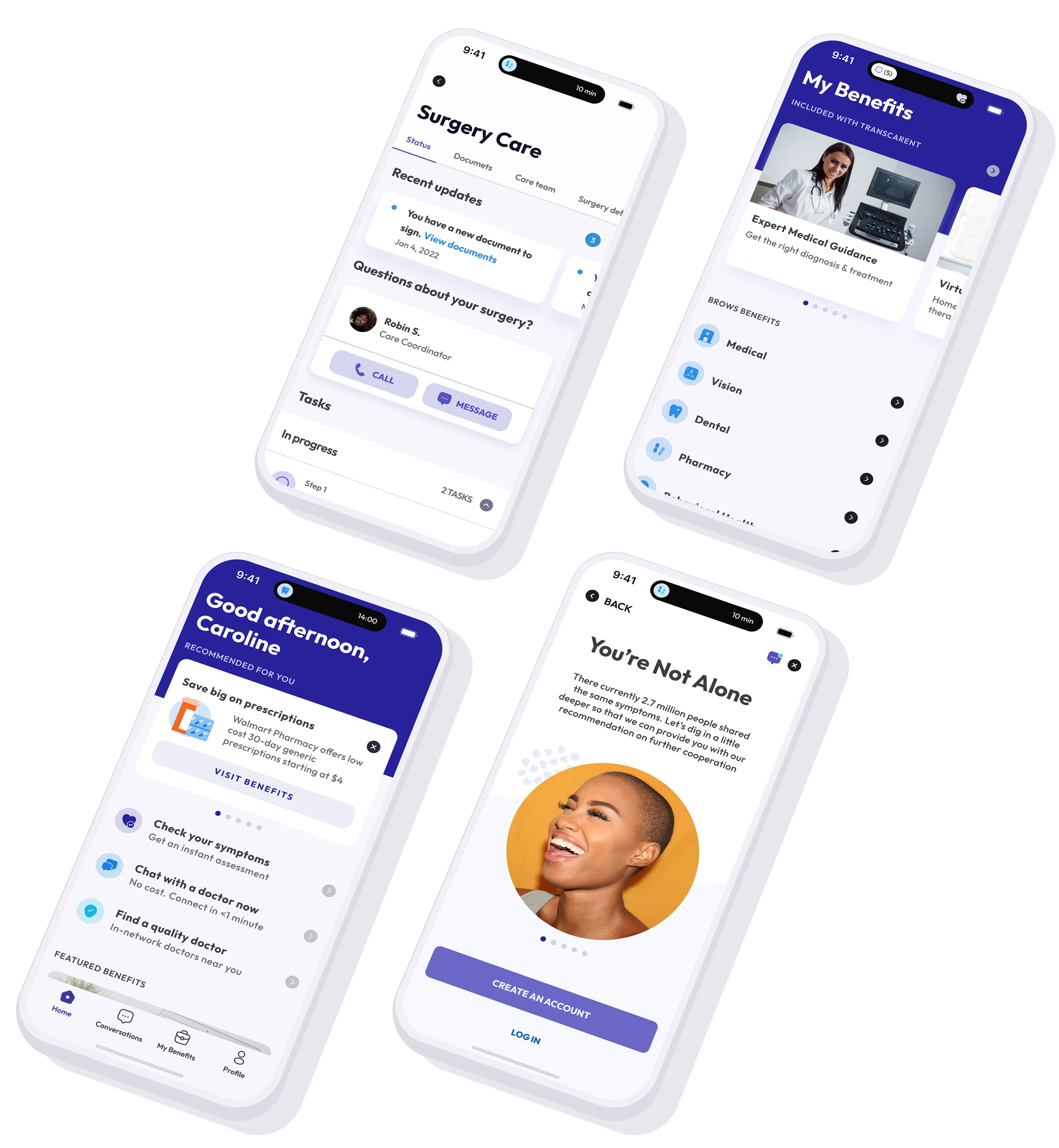
The home screen leads with contextual
recommendation cards rather than a fixed menu
of services, with a separate Benefits browser
available for members who want to explore
by category.
The home screen leads with contextual
recommendation cards rather
than a fixed menu of services,
with a separate Benefits browser
available for members who want
to explore by category.
The home screen leads with contextual
recommendation cards rather than a fixed
menu of services, with a separate Benefits
browser available for members who want
to explore by category.
The home screen leads with contextual
recommendation cards rather than a fixed
menu of services, with a separate Benefits
browser available for members who want
to explore by category.
Pricing engine, presented
as a recommendation
Pricing engine, presented
as a recommendation
Pricing engine, presented
as a recommendation
Pricing engine, presented
as a recommendation
Real-time prescription pricing, provider availability,
and cost data were integrated so the output reads
as a helpful suggestion (e.g., a lower-cost generic
at a nearby pharmacy) rather than a data dump.
Real-time prescription pricing,
provider availability, and cost data
were integrated so the output reads
as a helpful suggestion (e.g., a lower-
cost generic at a nearby pharmacy)
rather than a data dump.
Real-time prescription pricing, provider
availability, and cost data were integrated
so the output reads as a helpful suggestion
(e.g., a lower-cost generic at a nearby
pharmacy) rather than a data dump.
Real-time prescription pricing, provider
availability, and cost data were integrated
so the output reads as a helpful suggestion
(e.g., a lower-cost generic at a nearby
pharmacy) rather than a data dump.
RESULTS
iv.
Satisfaction and savings
43%
Members found lower prescription drug prices via the in-app matching
flow — validated that surfacing lower-cost alternatives at the point
of decision could shift member behavior.
Members found lower prescription drug prices
via the in-app matching flow — validated that surfacing
lower-cost alternatives at the point of decision could
shift member behavior.
Members found lower prescription drug
prices via the in-app matching flow —
validated that surfacing lower-cost
alternatives at the point of decision
could shift member behavior.
Members found lower prescription drug
prices via the in-app matching flow —
validated that surfacing lower-cost
alternatives at the point of decision could
shift member behavior.
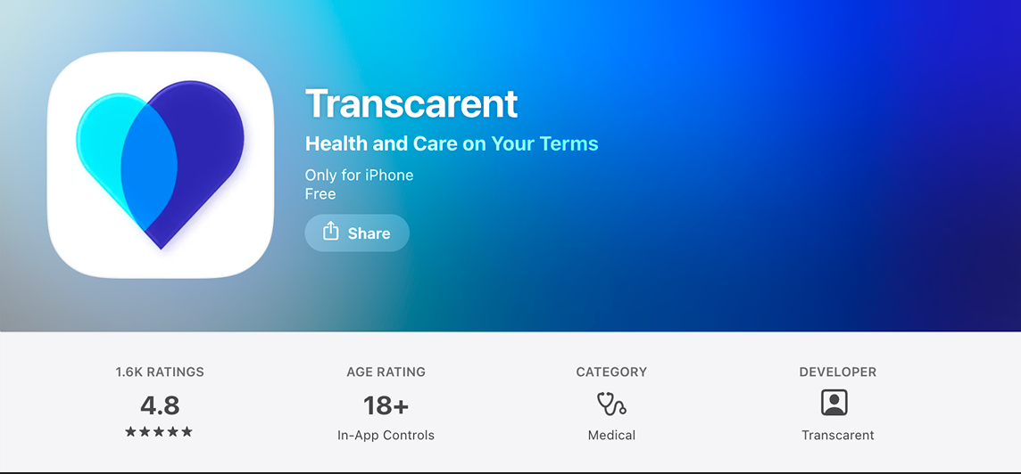
4.8
App Store rating across 1,600+ reviews — proved
that unifying five care verticals into one navigation
didn't sacrifice simplicity, even for less
tech-native members.
App Store rating across 1,600+ reviews — proved
that unifying five care verticals into one navigation
didn't sacrifice simplicity, even for less
tech-native members.
App Store rating across 1,600+ reviews —
proved that unifying five care
verticals into one navigation
didn't sacrifice simplicity, even for less
tech-native members.
App Store rating across 1,600+ reviews —
proved that unifying five care verticals into
one navigation didn't sacrifice simplicity,
even for less tech-native members.
Contact
Tell us what you're working on.
We'll respond
within one business day.
You've submitted recently
We'll review your message and respond
within one business day.
